DREAM Charter School — 20 Bruckner Blvd
DREAM Charter School was growing and looking to expand beyond East Harlem into the South Bronx. Their newest project was turning the iconic 20 Bruckner building, with the Uber billboard across the FDR, into a state of the art school. The converted historical ice house was being designed by Sir David Adjaye OM OBE RA.
In order to raise the necessary capital to complete the project they needed a new identity to build energy and excitement for potential donors.
First, a logomark
DREAM’S 20 Bruckner needed a new mark that borrowed equity from it’s existing mark, the home plate, but spoke to the building project.
To craft the new mark we took inspiration from building blocks, a symbol for the way Dream is built and builds its students. It was also important to include a nod to Dream’s home plate logo, a metaphor for safety, protection and kids’ unlimited potential. And we used the building blocks of all colors, the primary colors, to bring it all together.


The type treatment
1) ATHLETIC SANS REGULAR
A mainstay of the DREAM brand. Rooted in sport. Has a soulful, almost hand cut quality.
The blocks are building blocks. Foundational elements meant to create a sturdy foundation. They’re modular and enable us to create a more warm vibrant palette. They also reinforce a soulful, hand cut quality while at the same time signifying strength.
2) BLOCKS
The blocks are also inspired by the name plates on baseball uniforms. A name plate represents a human being, a family, a unique identifier. And at DREAM we care about each one of our kids uniquely. We know them and their family by name and are committed to the details of their lives.
3) NAMEPLATE


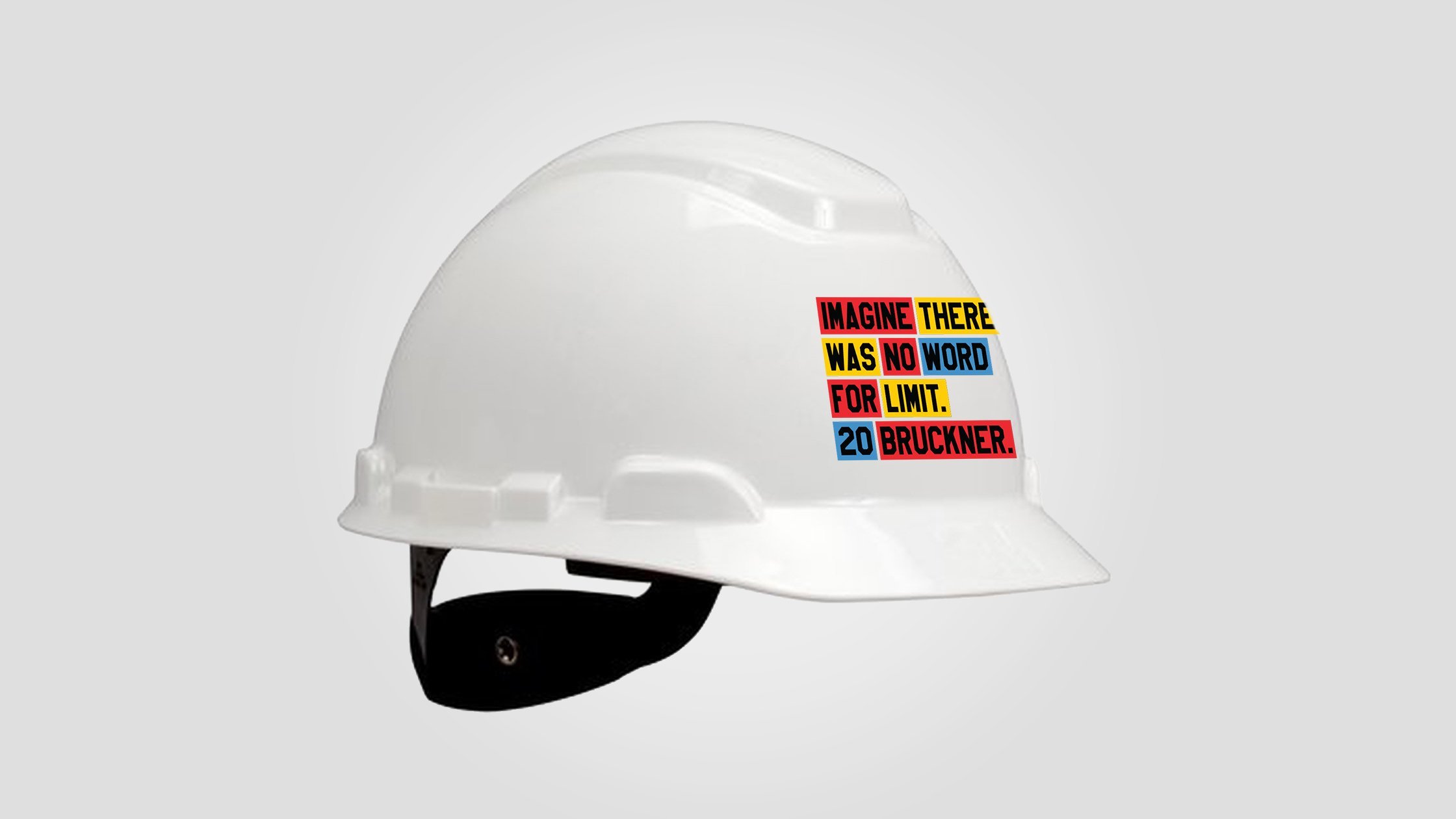
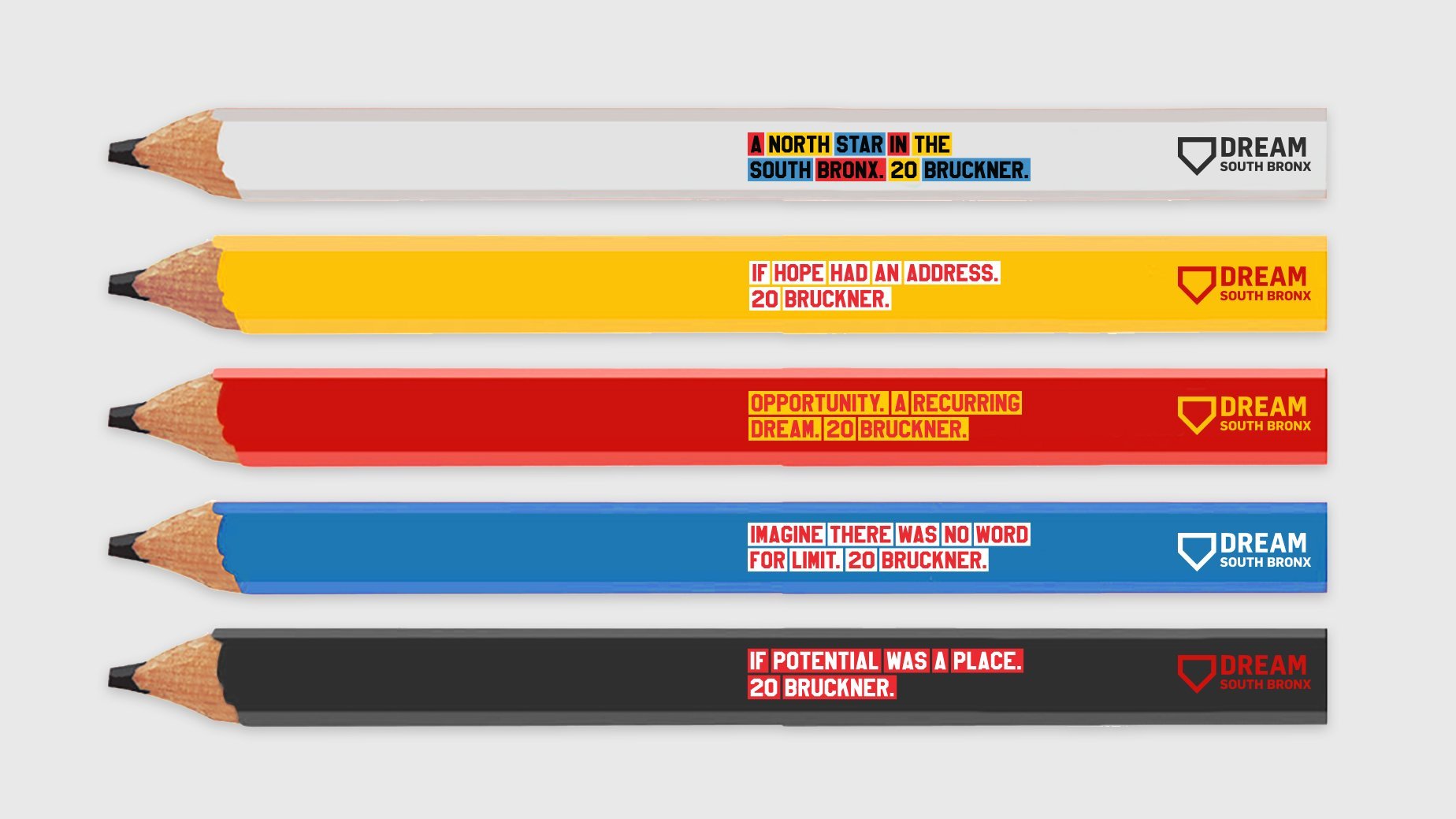
Donor & visitor gifts
We designed stylish gifts utilizing the identity that would appeal to all those that are invested in the school; donors, students, parents, and teachers. And anyone that took a tour of the new building during construction.


